Planning
Project Title: Time for Change
Personal Brief:
As part of an upcoming event you are required to produce material that highlights Lochgelly’s present atmosphere through the creative arts. The event will provide to residents/visitors of Lochgelly the current developments of housing, green spaces and businesses/shops etc. The event will show its past, present and future. Material can range from multimedia, computer animation, web design, digital film making or installation and intervention art.
The aim of the Graded Unit Project is to highlight the changes of atmosphere in Lochgelly between age groups and at certain times of the day throughout the week. Why are people at Lochgelly (near town centre) at that time? What activity are they interested in? Shopping, causing bother (in large groups) etc? It is your job to capture this “atmosphere”. All work must be that of the designers.
Key Questions:
- What are you trying to communicate, and why?
To highlight the changes of atmosphere in Lochgelly between age groups and at certain times of the day throughout the week
- Who needs the information, and why?
The viewer, residents and anyone coming to the event.
- What does the audience already know? What does it need to know?
The audience will probably know Lochgelly’s current “state”. They are needing to know where Lochgelly came from (its past), present and where it will end up (future). What are people’s attitudes towards change?
- What single, unique, focused message should the audience walk away with after reading or seeing this piece?
They should be able to identify areas of interest to different age groups, what people need are there certain attitudes towards certain parts of Lochgelly (key locations?) What feels do you feel walking through the town at certain times of the day?
- What have you done to communicate this type of information before?
None, but creating this material will highlight individual age group feels towards certain parts of Lochgelly will hopefully now be recognised more. Maybe areas are needing to be changed more than others.
- How do you expect your audience to respond to this communication?
Hopefully, they will find each other’s opinions interesting and take on board what other people think to try to change the current feelings of the town.
- The client (the sender)
Me as the designer putting the message of the atmospheres and attitudes out there to the public eye.
- The audience (the receiver)
It is aimed at anyone who is interested in art and design, Lochgelly, residents, investors in the changes started in the town.
- The message (the point to be communicated)
To use Computer Arts and Design technology to create an interesting take on the atmospheres created in Lochgelly. To change these attitudes for Lochgelly to grow and be appreciated more instead of being left behind and having the same effect to other new generations.
- The client’s motivation (the required result)
To change attitudes of people in order to change the atmosphere that will make Lochgelly a nice place to live.
- The audience’s motivation (why they would want to act on the client’s message)
To make Lochgelly safe and a good place to be no matter what time of the day, week, month, year.
- The environment (what else is in the way of the audience’s reaction)
If the event is not advertised then the viewers will not be able to be confronted with the atmosphere. If the locations chosen and groups of people are not interesting enough to the viewer they will lose interest and simply walk away. Viewer’s interest is key to them noticing and making changes.
- The audience’s desired response (cry, laugh, buy, fear etc)
Hopefully, they will find the material interesting and lift their feelings of the Lochgelly overall changing the atmosphere.
Defining the objective: To use Computer Arts and Design to create an interesting take on the atmospheres created in Lochgelly. To change these attitudes for Lochgelly to grow and be appreciated more instead of being left behind and having the same effect to other new generations.
Materials to be used/may be used:
Adobe Creative Suite – Photoshop, Illustrator, Premier
3DS max
Camera
Video Camera
Tripod
A high spec computer with speakers, scanner and printer and the above software will be used for all computer work.
Knowledge/skills wishing to be gained:
- Extended experience in the above Adobe programs
- More experience in different research techniques – not relying on internet too much
- Experimenting with ways of displaying information
- Think of new ways to display products i.e. innovative posters
Timescales:
| Week | Date | Activity |
| 1 | Dec 02 | Planning – brief, title, brainstorm, statement, timescales |
| 2 | Dec 09 | Planning – research resources, gather research videos and images, aims and objectives |
| 3 | Dec 16 | research |
| 4 | Jan 06 | Xmas holidays – Planning, initial ideas |
| 5 | Jan 13 | Mentor Sessions – arrange time and date. initial ideas and refine planning |
| 6 | Jan 20 | Planning Submission(see carnegiedigital) |
| 7 | Jan 27 | Development 1 start(see carnegiedigital) choose area of work and analyse designers and techniques (research) |
| 8 | Feb 03 | Develop min x2-3 concepts start |
| 9 | Feb 10 | |
| 10 | Feb 17 | Critically evaluate concepts and reduce to one final concept |
| 11 | Feb 24 | |
| 12 | Mar 02 | Development 1 submission (see carnegiedigital) – research and planning |
| 13 | Mar 09 | Development 2 start(see carnegiedigital) start developing final concept |
| 14 | Mar 16 | |
| 15 | Mar 23 | |
| 16 | Mar 30 | |
| 17 | Apr 06 | Easter holidays |
| 18 | Apr 13 | Easter holidays |
| 19 | Apr 20 | |
| 20 | Apr 27 | |
| 21 | May 04 | Development 2 submission (see carnegiedigital) – Production of final concept. Start evaluating the project and identify strengths, weaknesses etc. |
| 22 | May 11 | |
| 23 | May 18 | |
| 24 | May 20 | |
| 25 | May 25 | Final submission (1st) Fri 25th May Submission of all: Planning, Research & Concepts, Development, Final product, Evaluation |
| 26 | May 30 | Presentations Wed May 30th (2nd submission) |
| 27 | Jun 04 | Results! / remediation |
Tasks:
| week | Planning | Development 1 | Development 2 | Evaluation |
| 1 | Brief interpretation – few hours initially, can develop through project.Think of a project title.Answer questions (above) – few hours.Summaries question answers into a statement.Start setting timescales. | |||
| 2 | Make a list of aims and objectives – few hours, can add to as progress is made.Start researching run down areas try find examples of exhibition material. | |||
| 3 | Research continues. | |||
| 4 | Take research and develop into concepts (min x2). | |||
| 5 | Research exhibitions and idea development. | |||
| 6 | Refine all planning ready for hand in. | |||
| 7 | Look at designers, artists etc. for more inspiration.Relate research and development. | |||
| 8 | Drawing, collage, photography. | |||
| 9 | Develop ideas by taking inspiration from previous. | |||
| 10 | Develop concepts and research – if needed. | |||
| 11 | ||||
| 12 | Critically evaluate concepts and decide on final concept. | |||
| 13 | Refine Development stage 1 for hand in. | Start Development 2. | ||
| 14 | Start creating final concept – researching where needed. | |||
| 15 | ||||
| 16 | Evaluate progress. | |||
| 17 | Continue to create and develop final idea. | |||
| 18 | ||||
| 19 | ||||
| 20 | Evaluate. | |||
| 21 | Refine any loose ends for hand in. | Reference modifications to project.Identify changes and state reasoning. | ||
| 22 | Reference areas that were not effective.Make sure there is critical evaluation throughout project. | |||
| 23 | Identify strengths and weaknesses. State how they can be adapted for future projects. | |||
| 24 | Refine any weak areas of project. | |||
| 25 | Final submission (1st) Fri 25th May Submit all: Planning, Research, Development, Final product, Evaluation. |
|||
| 26 | Presentation & second submission. | |||
| 27 | Results/Remediation. |
*I may have left some weeks in the above table empty as the work identified in earlier boxes may run through into those weeks also work may happen quicker and tasks completed earlier than expected. I hope to stay within my time line as I wish to use my time efficiently. This will be key as the project develops.
Research resources:
Lochgelly library – Books on Lochgelly – source of old images/information.
Analysis of Lochgelly residents – what do they think of Lochgelly – I could make a questionnaire
http://www.lochgelly.net – good source for images
http://www.lochgelly.org.uk – images, information on redevelopment
http://www.scotlandcharrettelochgelly.co.uk – information and new or future images of Lochgelly
http://www.scotland.gov.uk/Topics/Built-Environment/regeneration/pir/learningnetworks/towncentres/CaseStudy103Lochgelly
http://www.google.com/maps – map of Lochgelly, sourcing areas to do research and development
http://www.fife.gov.uk/orgs/index.cfm?fuseaction=display&orgid=1608BF22-D2C7-4C49-992FA90A231D1126
http://www.guardian.co.uk/uk/2004/jan/25/britishidentity.stephenkhan (good inspiration to prove author wrong, change his view)
http://www.scotregen.co.uk/news/default.asp?ItemID=1130 – again to look back or into the future plans
Internet – for any additional research, development, evaluation etc.
Photographs, video and sound recordings of Lochgelly (by me)
Interactive – search either internet or preferably travelling to its location to experience it firsthand.
*more links will probably be added as my research will continue throughout my project as I develop my thoughts and work.
important! – Previous projects (myself) found at gemmah396.wordpress.com
Research:
Other “Run down” Locations and success stories (urls of articles I have read)
http://www.scotland.gov.uk/Topics/Built-Environment/regeneration/pir/learningnetworks/towncentres/casestudies – a list of areas that are currently being redeveloped by the Scottish Government and various organisations, details are given on weaknesses and how these can be improved, Lochgelly appears on the list.
http://www.insidehousing.co.uk/%E2%80%98ghost-streets%E2%80%99-handed-%C2%A3355m-regeneration-fund/6519285.article – This article shows how much money can be spent on regeneration and how long the process could take.
http://www.yorkshire-forward.com/media-centre/our-success-stories/scarboroughs-regeneration – success
http://www.objectiveone.com/client/media/media-931.htm
Conventional vs Innovative Exhibitions
http://www.vam.ac.uk/microsites/decode/exhibition/interactivity – innovative/interactive exhibition – really good inspiration for concepts.
http://www.dailymail.co.uk/sciencetech/article-1362126/CeBit-2011-The-device-allows-pedestrians-buy-shop-window-stepping-store.html – idea can be developed to suit project
http://www.creativeguerrillamarketing.com/guerrilla-marketing/12-must-see-guerrilla-3d-projection-mapping-examples/ – some good examples from big companies such as Sony this can be used as inspiration for my project
http://www.creativereview.co.uk/cr-blog/2009/december/barnados-interactive-poster
http://www.customqrcodes.com/story/11/Top-Five-Tips-When-Customizing-Your-QR-Code-Design-
Concepts:
Idea One: To create promotional material for the exhibition. The exhibition will be conventional, where people can come to the building where it is held. The exhibition will be free to the public as this will encourage more people to attend. The idea is to take a ‘traditional’ approach by creating banner posters, leaflets, flyers and tickets. The main theme of course being the towns’ atmosphere.
The some of the products such as the flyers will include some basic forms of interactivity. The interactivity being qr codes, this is a current trend in posters at the moment and more and more people are buying the latest mobile phones. I think this would be popular with younger people and technology fanatics.
Idea Two: I will take an innovative, technology approach by creating material that includes projection mapping. The above list of research is inspiring to take on board how design is moving into a technological age. I feel that if I create a project mapped product it would look more realistic and can confront the residents to change their ways and to allow visitors to change their opinions of Lochgelly.
For example, taking the loud and sometimes feared youths and making a projection map of them acting in this way and projecting them onto certain buildings. This can allow parents and residents to be faced with the current behavior of that age group. Hopefully, this will make them see their actions and how it affects the community as a whole and maybe they can change their ways.
Research & Concepts
A large amount of research can be taken from a similar project on the areas and locations of Lochgelly found at: https://gemmah396.wordpress.com/advanced-project/
Concepts
One: “Expression”
The idea is to focus on feelings and to show your expression of the town. How you feel of certain areas, people, buildings, future aspects etc.
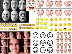
The first thing I think of when I hear the word expression is instant messaging smileys. I aim to use this as base for this concept.
I have thought of possible ways for the public to air their opinion of the town and have come up with an idea that can be easily developed.
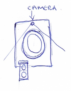
A photo booth located in a popular area where people can go in and ‘shoot’ their own expressions. Instead of the photographs being printed it would print your expression stickers. The user could then take the stickers to locations, areas, buildings etc. and place them on notice boards that would be there. The expressions would be tallied up by the council, area developers etc. and they would be able to see what aspects of the town the residents and visitors are happy with and not happy with. I think this would be a better way to show your opinion than using a voting system. It also keeps your opinion anonymous.
I have come up with the concept of using real photograph instead of cartoon faces. This can be achieved by using a photo booth that will allow the user to print their emotion stickers that can be placed next to the places where they find trouble to be in the town. There can be boards of different characters of different age groups. The person can place their emotion on the character to show how they feel for that age group.
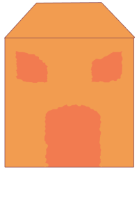
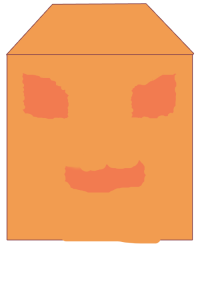
Instead of using people as faces another avenue to explore was buildings portraying an expression, taking on board a comic/cartoon design.
I have dismissed this whole concept for the one below as I have run out of creativity. The emotions are over used especially with the amount of emotions in mobiles and online. I thought this would be a good idea because of this as people do use them a lot in everyday life but maybe using them in this way would be boring and would not gain interest from the audience.
The residents of the town are constantly hearing at the moment how bad the buildings are in the town and using this concept would just add to that therefore the concept below will give the chance to explore why the town has gotten to that stage. Do people really care about the town? Do they want to be better? Are there certain people tainting it?
I wish to question this not to point out direct people but to open their eyes to how controlling certain people are in the community. Lochgelly is not a community without being comfortable around each other. Do we feel comfortable?
Two: “Puppets”
This idea was to use the age group of 12-19 year olds as an example to showcase people’s feelings towards them. Many people feel the youths, particularly, run the town therefore I aim to confront residents of this behaviour.
The main aspect I am focusing on is not to name the youths or show details of who they are, therefore I am using a silhouette.
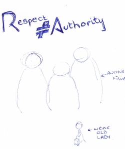
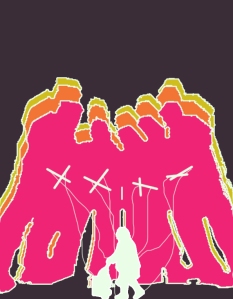
I have a few designs in my head where the youths would be seen as puppeteers and the rest of the town as the puppets.
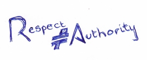
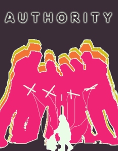
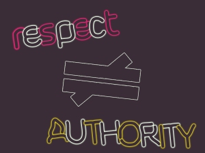
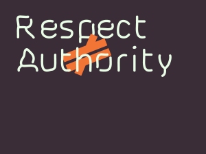
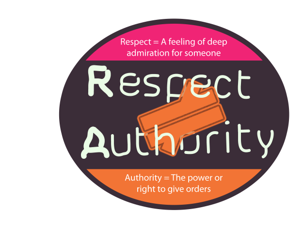
The idea of using the slogan Respect (does not equal) Authority is to show that there is no link between the two, their definitions are not the same. Some feel the youths are wanting respect from other age groups and they do that with displaying themselves as an authority figure.
Also, to create an atmosphere in the town (fear) I thought maybe using decaling and projection mapping to project the silhouettes into the ‘hang-out’ locations.
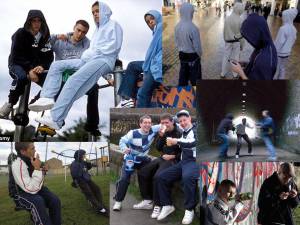
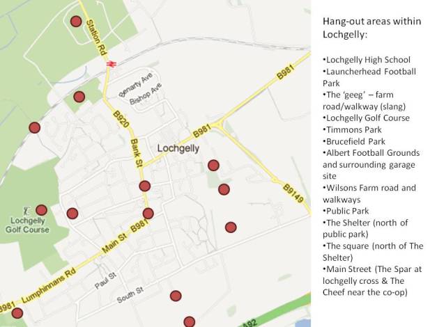
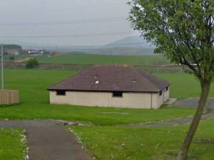
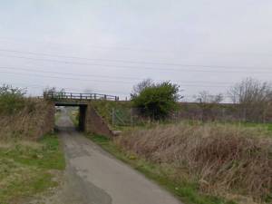
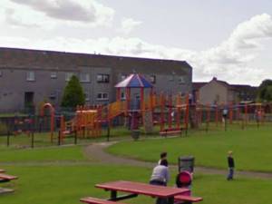
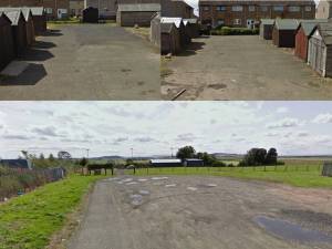
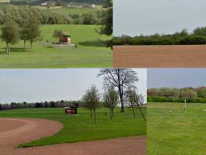
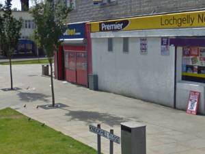
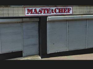
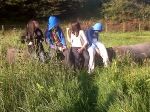
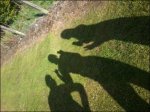
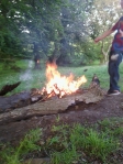
Below are some moodboards and photographs I have taken ofthe towns hot spot areas:
‘Hang-out’ Spots:
Some of the behaviour that goes on in these areas:
Visual Research:
Videos are from youtube.com
An insight into the scale of youth crime.
Is Facebook to blame for organisation of such crimes?
Are certain people controlled or targeted by youths?
Videoing pranks, crime is a big issue e.g. happy slapping
Is it only the police trying to take back control and confronting them?
A poem used to show youth culture and to inspire change
*It was very difficult to find video footage of youths as the government is trying to tackle youth crime through banning and preventing video footage and images of the above behaviour.
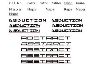
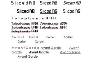
Investigation into typography and colour schemes:
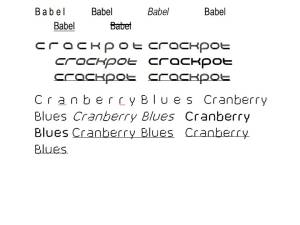
further examples of typography using the basic modifications of bold, italics, underline, strike-through, and spacing – as part of intitial investigation
Concept Development:
Hang Out Areas:
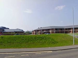
 There are several hang out spot in the town as pictured above but the one of interest for them is the purpose built ‘shelter’. This was made to attract them to hang out here instead of in the town centre – It works but only to a certain degree as they still now and again liek to hang out in the centre.
I want to hit the message hard to them that they respect this place and know one else is really allowed to use it (as they see it). It is theirs.
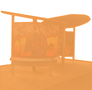 If it is their place then why do they graffitti it. If they treat it with respect then why do they grafitti it like they graffitti other areas of the town (some they do not like). The graphic above was connected to the idea of starting fresh but maybe remembering the past look of it. The opacity of the colour overlay allows this idea to be fullfilled as it is coloured over but you can see all the details if you look closely.
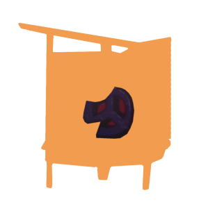 Concentrating on the idea of respect and places they dont respect in the town, I have cropped out the peace sign as I felt it would be a good concept to highlight they put respect in their graffitti but they dont respect the places they graffitti. I had hoped they would have used this sign in another place as this would have made a great link but they didnot. I am beginning to feel this concept is running out of good hard hitting ideas.
 I was having a last minute development on this idea but as you can see there is not enogh potential to make this concept work. I feel if I focus on a new concept there would be more potential and I couild fullfill my personal potential on the project. It is a good concept but lacks direction for me personally.
Puppets:
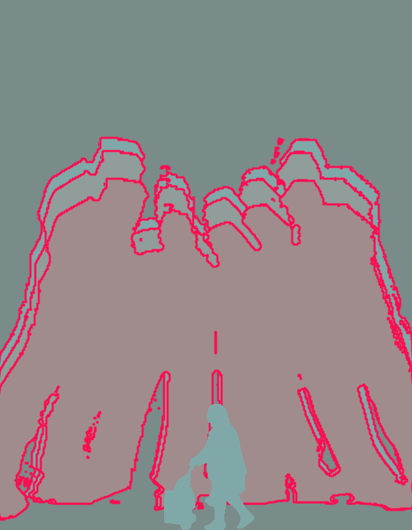
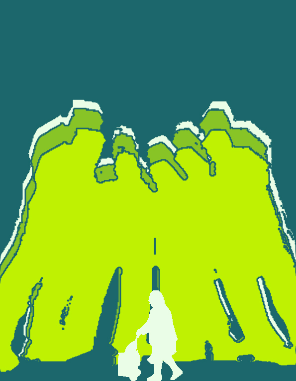
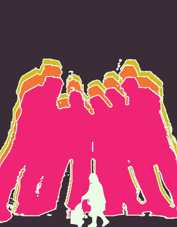
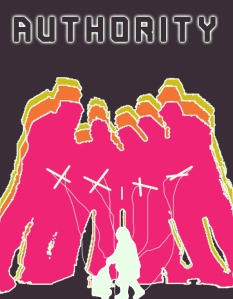
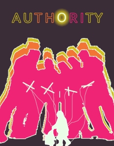
I have taken the silhouette idea from above and created a gang of teenagers an old woman with a shopping trolley. The use of a silhouette is to not show any faces of the ones involved in gangs and to not show the face of the vulnerable. This is important as people may perceive this as targeting them directly. It is simply to highlight their behaviour and to hopefully make them aware it can be frightening.
The stance above shows the way the teens present themselves. It is like they are ready to fight, can be seen as angry. Hoods are up and they are looking down at everyone. Do they want to be feared?
The idea of using the youths as an authority figure above the frail female pensioner. The difference in body strength between the two heightens the concept of authority. Why do teenagers feel they need to be respected by the older generations? Why the need to rule the streets of the town?
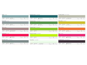
I evaluated the above colour schemes with the concept and feel from a design point of view that the last example is the best.
Colour scheme 1 — can be dull as the silver and grey tones makes the concept look dim and uninteresting. The pink accent colour works well with the grey but I feel taking the pink and applying it to the last colour scheme would be more beneficial.
Colour scheme 2 — The green is bright and fresh. The white highlights this. It is hard to dismiss this palette because it is clean and vibrant but the palette I feel has been used in other designers work therefore I must find a new colour scheme rather than copying previous palettes.
Colour scheme 3 — This is the chosen colour scheme for the project. The brown is not dull and is a good background colour. I was originally going to use black but I feel as a designer that using bright vibrant colours the automatic background colour would be black or white.
Colour psychology:
green – health and well being
pink – calming
yellow – cheery but can create frustration and anger if too bright
brown – warmth, comfort and security. Can be a sophisticated colour
red – anger, excitement , adrenaline
blue – calming, sadness but people tend to work better in a blue painted room (active)
orange – excitement and enthusiasm. People are drawn to orange, focus attention
white – innocence, space and cleanliness
black – death, slimming and absorbs light
purple – royalty, wealth and spirituality
The final colour scheme features pink, orange, yellow, brown, white and purple. I feel given the psychology behind the colours these are great colour to work with for the project.
I have dismissed using red, a strong green and black as the negative values of the psychology could make people who see the concept feel anger, excitement – they are encouraged that this is right, there is no problem and change is not needed.
The updated colour scheme:
Refining the Graphic
I have refined the graphic by erasing the rough edges and spots found around and out with the true outline of the characters. I have however applied a filter effect that gives the graphic a rough edge. This possibly could heighten the idea of the rough youth characteristics.
Typography
I have in previous projects struggled with effective typography therefore I have taken the time to research this area. Below are links to some of the tutorials I have studied:
http://www.fontshop.com/education/
My Concepts:
(before typography research)
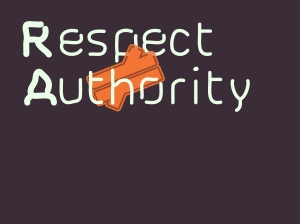
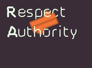
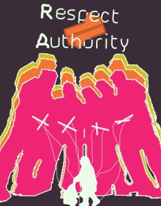
Placement is also a key element to designing the poster. It can draw the eye across the poster easily and therefore the viewer will take in the message being conveyed. Below are amendments to the title using layering techniques:
The above is very plain and the graphic is behind the text which the viewer may not find attractive. If the graphic is not attractive and gains their attention then they will take less notice.
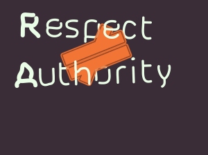
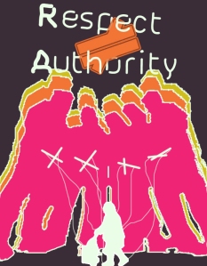
Using layering the graphic appears more interesting and appealling. Having the letters individual in text boxes allows me to move them on their individual layers. Moving the graphic over the p highlights the word respect. My eye is imediately drawn to the P. When I see the P I want to know what word the P is in therefore I read the whole word.
To heighten the effect of the graphic I have used a textured edge around the graphic this is to compliment with the puppet graphic edges.
Small change of the edge. I have added a stroke after the noised edge to make the graphic more sleek and refined this compliments the smooth typography.
Again to highlight the words more I have altered the layering of the letters.
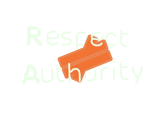
Doing the same with the letters of the word Authority draws the eye to the word. The eye is led from the word respect to the graphic then the word authority.
This is the final version above and below:
The last example above I felt was the best therefore I have placed the text onto the concept graphic:
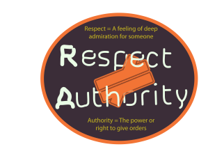
Above is a smaller version of the title. I feel the one below works best as the title is big which grabs the attention of the audience.
I feel I have progressed from previous projects by simply looking at the typography and the message I want to convey. These tutorials have helped me to fully convey the message. I will take on the advice through to future projects as this is helpful information for projects in all areas of design concerned with typography.
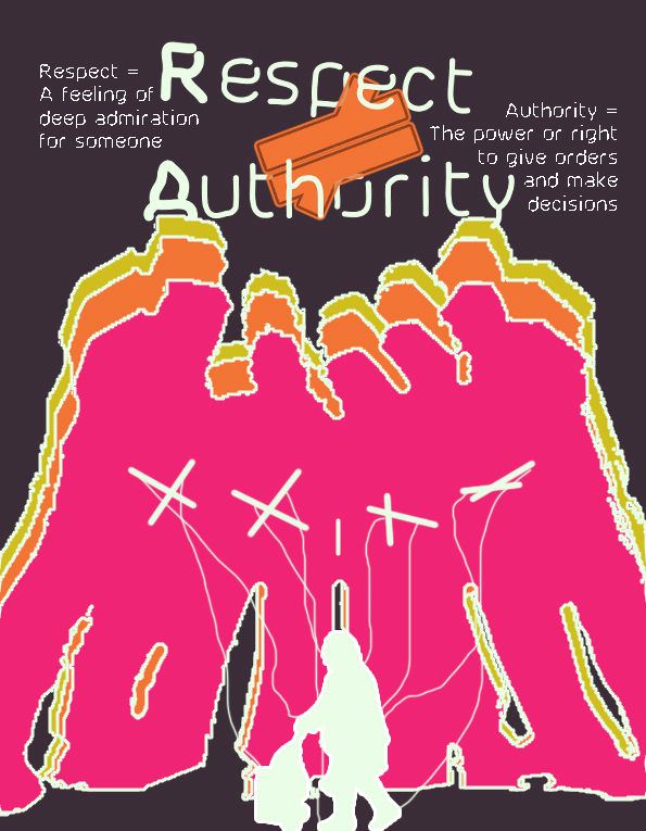
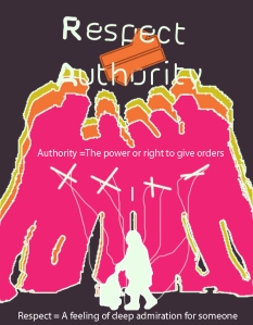
Another idea to tkae the concept further was to have a poster/flyer that displayed the definitions of respect and authority thus to convey the message more:
I have chosen to use the smaller title in this poster concept for the simple reason the definitions have more space. This allows the definitions to have more of an impact if there is sufficient space to seperate the title, graphics and definitions.
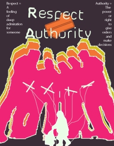
The placement of the text is not appealing. It looks as if the paragraphs have just been randomly placed and do not balance with the rest of the poster.
The idea was to have a border (as equal as possible) around the top half of the poster to make it look clean and slick but the word placement does not work at all. The idea of having plain text looks to be unappealing, more experimentation is needed.
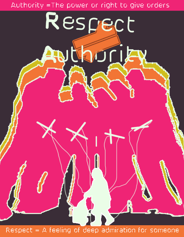
I wanted to link the text to the characters within the graphic. The authority definition being linked to the authority figures of the teens and the respect linked to the elderly woman (respect your elders). The fact the the teens get the meaning of authority wrong and they no not employ the saying ‘respect your elders’ – it is almost a golden rule within any community.
The final poster design (large one) above takes the idea of linking the text to the figures forward in the fact that the text connected to the teens is at the top and the one connected to the elderly woman is at the bottom. This is a hint at the teens being bigger, better, above and in control of those that are at the bottom (elders). Everyone is beneath them.
The smaller poster idea is a version before the final one. The changes that were made included colour. The colour changes were to relate the colour pink to the youths. The text colour was changed to white to make it more readable and noticable.
Another reason why this border concept works is the way the eye is lead to the graphic in the center, to the authority meaning at the top and then to the definition of respect at the bottom.
It is easy for the audience to make the connections thereforethe message is conveyed more.
Sticker, Place Mat, Additional Logos, Screen Based Design… :
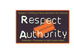
I felt as though the shape does not compliment the overall look I am tryin to achieve. The idea would work but I could explore it more.
Just by simply changing the shape of the design makes it more appealing. A colour change would not have made the same impact. Now I think it would be best to experiment with colour.
There is something missing in the above examples. I need to make a stronger connection between the products made. I need to make the concept flow more, make it stand as a WHOLE project.
I have taken the border idea and incorporated it into this, the above examples (thumbnails) are previous versions where I have been experimenting with colour. The larger example I feel is the strongest as the slogan is emphasised more.
If the outer stroke was:
pink – there is too much emphasis on the authority definition
orange – too much emphasis on authority meaning
The other colours used do not compliment the look I am trying to achieve.
Also, I want to keep the links between the text, meanings and graphics strong throughout the products.
Decalling Idea:
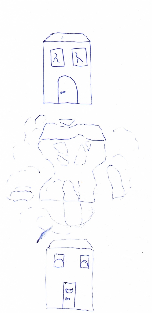
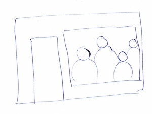
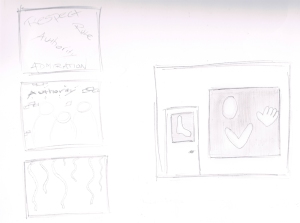
To create more of an atmosphere in the town the concept can be manipulated so that puppets are seen in the windows of local buisnesses and shops or at hang out areas. The decals would probably work best if they were blacked out as this would evoke the emotion of fear.
Sketches:
There can be many different versions not all windows have to be the same. For example they can alternate, one having the various body parts (which can differ too), another words related to respect and authority and another window displaying the poster concept above.
Digital Versions:
I have adapted the decal idea so that there are several different ideas that can be used at the one time. Alternating designs in windows. There are so many possibilities within this decalling concept but I have focused on the idea of shadows. The decals are coming from the dark which makes the viewer look twice to what is there – creating a fearful atmosphere. Teh same atmosphere towards the teenagers will be inflicted upon them as they are the ones out in the town centre at night. Below are the ideas developed digitally:
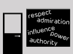 A text version of the decals using words associated with the slogan respect does not equal authority. Another variation is below:
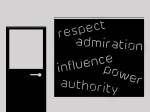 This one has more emphasis on the shadows. Making the viewer look and think twice as to what it is.
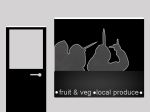 I wanted to use the poster silhouette but after consideration to the look of the whole project and creating an atmosphere I felt a change of silhouette for this decal was best. I wante to use a silhouette that reflected more of the deeper bad behaviour and activities. I chose the one above as it reflects ongoing environmental issues of knife crime. Knife crime is as I say ongoing and becoming more frequent within gang culture particularly in youth gang culture. I wanted this to be hard hitting and confront exactly what is and what will become more frequent in the town if it does not become controlled.
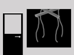 I wanted to keep the overall concept flowing through my designs. I took the puppet strings idea. This concept can be developed more to feature objects hanging from the strings. I had the idea of having people on each string but felt that it would reflect too much on hanging. Therefore, the idea of the strings being cut an know one being on them was best. I was hinting at if the youths are controlled know one is on the strings – they are let loose.
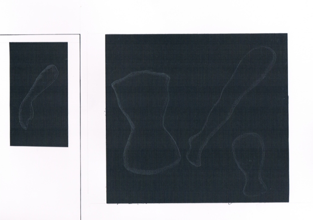
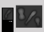 Finally, I have developed the body parts idea into a digital version. This has helped me to ‘see’ how the design will look if manufactured, the filter effects added in Photoshop give a real sense of how the shadows can help give of that uneasy feeling if walking past them on a dark night.
Projection Mapping Concept:
research:
http://www.creativeguerrillamarketing.com/guerrilla-marketing/12-must-see-guerrilla-3d-projection-mapping-examples/ – some good examples from big companies such as Sony this can be used as inspiration for my project
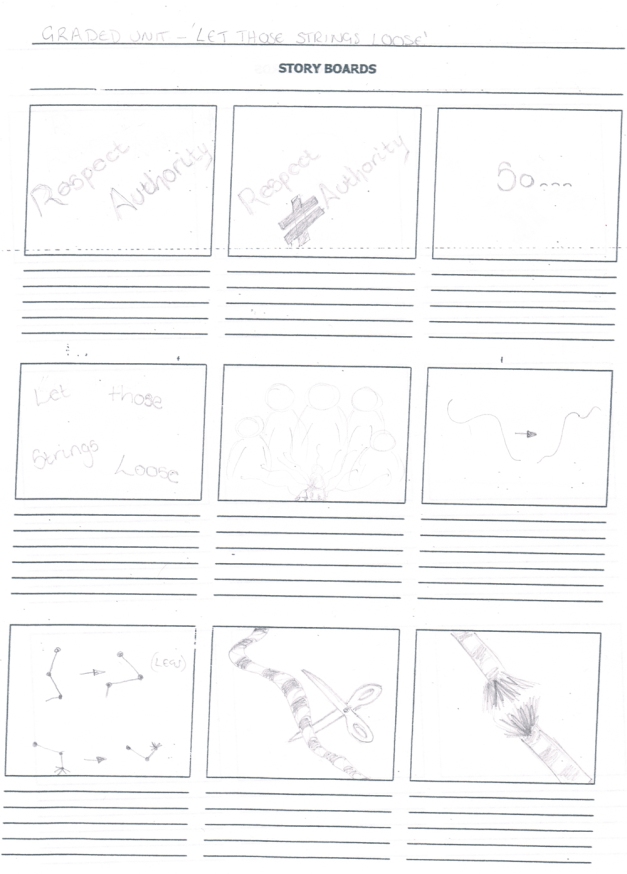
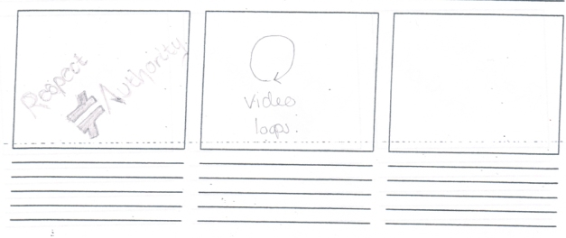
Storyboard:
It is a very simple animation, using the designs that I have created but applying the hopeful ending of reducing or even taking away completely, the control from the youths. The animation would continuously play and be projected in various areas in the town and could be played as part of presentations, animation on a website, or as an advertisement on screen.
The idea of the puppets is to link the fact the elderly people are being controlled over where they walk through the town. They feel intimidated by the youths if they walk in the town centre therefore they try to miss that area completely. The strings and body parts moving (jerking) makes that connection, they cannot control the jerking, only the youths.
Digital Frames:
I have made a series of digital frames that I then put together in Premier Pro to make a short version of the intended Projection Mapping. There are areas in the animated sequence that do not show movement. Theses areas are 3D movements. The strings of the puppets will move, in unpredictable ways as the teens control the oap’s movement. These jerking moves are to show how the teens can manipulate them. The loose writting comes towards you as if it were coming out of the screen (3D) – confronting youths of their behaviour. I have not been able to create the 3D movements due to restrictions of my skills but I have made a concept that could work well on a 3D screen or to be projected. The video is below:
Evaluation
The aim of the project was to highlight the ongoing social issues within the town, the changes in atmosphere between age groups. The age groups I paid particular attention to were youths aged 12-19 and the town’s elders. The elders feel the teens are taking control of certain locations within Lochgelly. These areas are in the town centre, main roads and pathways that the elders walk on daily occasions. When there are younger people around them they feel they have to go another route, which can even force the older generation to not stick to their daily routine as they feel intimidated. The main point I had to consider during the project was the fact that many people are involved in this situation therefore the blame cannot be put on one individual, hence why I have chosen to use silhouettes in my designs.
In the early stages of the project I experimented with the idea of using smiley’s. The smiley’s would be used as a rating system. The smiley’s could be stickers that would be stuck to boards referring to particular areas or people the older generation felt needed to change. However, I could not focus on extending my creativity within this concept. One reason was that the emotions are over used. They are used daily among almost everyone, in mobiles and online. I thought this would be a good idea because of this as people do use them a lot in everyday life but maybe using them in this way would be boring and would not gain interest from the residents and visitors. A second reason was the residents are constantly hearing how bad the buildings are and the unemployment rates etc. Using this rating concept would just add to that.
The above idea would have been conventional, print based. I feel I need to introduce an innovative element to the exhibition for the community to be interested. I researched innovative exhibitions and design campaigns. I came across the idea of projection mapping which would allow me to consider designing for projection as this is a popular design feature in advertising. Also, Lochgelly will a showcase of youth behaviour. The town will be lit up throughout the night with projectors.
Focusing on the main concept for the exhibition against youth behaviour I wanted to concentrate on the idea of control. I thought of ways of how people can control others. Managers, bosses, bullying etc. Puppets – people control puppets. The puppets are not alive but the puppeteers can control the movements of the puppets. Youths control the routes the elders take. It is the same basic idea.
Using the gang of youths and an elderly frail woman with her shopping trolley conveys this completely. Adding the strings just makes the graphic stand out. The teens stance shows exactly how they want to be perceived. It looks as if they are ready for a battle, they are angry. Their hoods are up and they are looking down at everyone that comes near. The difference in body strength is so clear, creates a sense of authority.
The slogan Respect (does not equal) Authority is to highlight the teens are getting it wrong. There is a distinct difference between authority and respect. They want respect through being an authority figure but they need to realise this is not the way to gain respect as they will never get it through the way they are trying to. I have created two posters, one with the slogan and one with the slogan and definitions.
In the poster design with the definitions I wanted to link the definition text with the graphic. The authority definition linked to the youths and the respect definition linked to the elderly woman. I also think the link between respect and the elderly woman refers to the saying and golden rule of any community, “respect your elders”. I think this is a nice touch to the project as it sums up the youths actions well. The final poster design for the definitions links this even more through the use of bordering the definitions at the top and bottom. The text at the top is highlighting the fact the teens feel they are better, above those at the bottom and in control of them as well. The elders are always below. The colour also helps to convey this. I concentrated on the way the eye is led on my designs as this is key in the way the audience perceives the message in them. The colour theory and bordering of them help lead the eye to the graphic (centre), to the slogan then to the top definition then lastly the bottom.
One way the town can get involved in confronting the controlling behaviour of the teenagers is to put decals on their windows to show their support. I created several designs that can be alternated so that each window is different – not to get bored looking at the same design all the time. The decals are coming from the dark which makes the viewer look twice to what is there – creating a fearful atmosphere. The same atmosphere towards the teenagers will be inflicted upon them as they are the ones out in the town centre at night.
The projection mapping is a very simple animation, using the designs that I have created but applying the hopeful ending of reducing or even taking away completely, the control from the youths, through the use of the strings being cut. The animation would continuously play and be projected in various areas in the town and could be played as part of presentations, animation on a website, or as an advertisement on screen. The idea of the puppets is to link the fact the elderly people are being controlled over where they walk through the town. They feel intimidated by the youths if they walk in the town centre therefore they try to miss that area completely. The strings and body parts moving (jerking) makes that connection, they cannot control the jerking, only the youths.
I have made a series of digital frames that I then put together in Adobe Premier Pro to make a short version of the intended Projection Mapping. There are areas in the animated sequence that do not show movement. Theses areas are 3D movements. The strings of the puppets will move, in unpredictable ways as the teens control the oap’s movement. These jerking moves are to show how the teens can manipulate them. The loose writing comes towards you as if it were coming out of the screen (3D) – confronting youths of their behaviour. I have not been able to create the 3D movements due to restrictions of my skills but I have made a concept that could work well on a 3D screen or to be projected.
The puppet concept can be taken to the extreme of having graphic images of the consequences of the youth’s behaviour. I also considered using sound in the areas where they hang out. The speakers would be hidden and sounds of other gangs would get louder – as if they were approaching them. This would be an element of surprise and fear but they youths may not take this well and can cause more damage to the community. There are so many possibilities.
One of the biggest areas I have struggled with in past projects is research. The general flow of research into concepts has been lacking. I used to think of a concept for the final products and immediately go with it but now I have learned to research a variety of areas and generate possibilities, to then take those possibilities and refine them until I can dismiss them to create one final successful concept for a project. The initial research into conventional vs innovative exhibitions has led me to combine print design and new technology within the project allowing all areas of advertising to be targeted.
In some areas of my research there were problems I had to overcome. For example the biggest problem was gathering images of the behaviour of the youths. I could not film them or photograph them without their knowledge and if they did know what I wanted to do they would never let me. I referred to friends of mine who are the age of the youths I was targeting therefore I asked them if I can have them acting as the troubling teens. I did not want to blame them for the actions they were representing therefore I blurred out any aspect that identified them as the culprits.
I wanted to research youths in other town to show a trend but at the time I had come away with little evidence. I found a few videos on the internet and a comment on one of those videos was from a member of an organisation to help troubled teens. The statement revealed that the internet does not hold a lot of video, photographs and other media material concerning youth behaviour. The reason being the government is banning any such material being on the internet on a permanent basis for young people to view. This is part of a wider target of the governments against youth crime. At the time I should have taken a screen shot for evidence in my research. I need to consider this for future projects if something similar happens.
One large area of weakness in my designs in previous projects was typography. I found it difficult to make the type work well with my graphics. I felt more research was needed in both the use of typography and the psychology of it, combine that research with colour theory and I should succeed. I viewed many Youtube videos of designers explaining how typography works and how fonts are used to ‘attract’ and keep the audiences ‘attention’. I feel this step in my process has really boosted my knowledge and without it I would not have achieved the result I have. This is definitely one aspect I will need in every project from now on.
One strength in particular I want to mention is the flow of my project. The project features most of the aspects across a range of products. The typography, colour, graphics, framing all matches. This is another point I have developed from precious work as some of my designs were either not flowing or too similar that it became boring. I must consider the entire range of products for the design to go on to but only at the stage where the actual concept is ready for product experimentation – where the design is placed on a poster, mug, t-shirt etc. I used to think of the products first not the concept but my creative process has changed dramatically to thinking the opposite.
I feel I have stuck to my timescales well but certain areas were a little hard to manage. For example, research was particularly difficult as research happens throughout a project and different aspects at different times. I need to establish more what research should be done at the beginning as a base for my process. I think this will help my development stage as I then do not have to go back and do more basic research. For example, remind my self of basic typography skills at the beginning so I do not have to do it during concept development. I can concentrate more on trying out different fonts.
Overall, I feel I have fulfilled the brief to the best of my ability and without any major problems. I have created a concept that can work well as an exhibition and advertising campaign against youth behaviour and can be developed into a campaign against youth crime, or at least linked. The concept can be taken to the extreme, as mentioned above. The graphics can be heightened to feature more real life images and how people are affected by the actions of those that take part in such behaviour. I have developed as a designer, in the fact that my process has changed and I have gained experience in designing for a range of conventional and innovative design.
*IMPORTANT link to valueable research and information found on the other pages of this blog.
